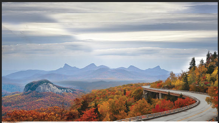
perfect, this is what i was looking for. i think it can totally work. i think what can do is bump looking glass rock slightly right, parkway slightly left, parkway up a little bit, looking glass up like 30% of height so its at more diag with parkway. then the two main points will almost exactly fall on diag line between top left corner and bottom right corner giving good flow.
then can kinda wrap some profiles of trees/etc around border to sort of frame it up
hm ok thought it may look like a volcano if it was higher than road, but doesnt really. whats that border?
Justin Bernard on November 11, 2013:
borders in foreground, will vaguely draw in some trees/shrubs/etc, like below, to frame it up
Justin Bernard on November 11, 2013:
to make this simplified drawing style work, it takes lots of layers, so on each layer you can keep things simple. and just use color to denote layer depth kinda, so like 1-2 colors per layer, getting darker on things you want to obscure. same style is going on with AB site http://fleeangrybear.com/
ex:
Taylor Bernard on November 11, 2013:
that waterfall looks pretty sick. looks like art nouveau style
Justin Bernard on November 11, 2013:
the trick on this stuff is thinking through how its being broken into elements. take a look at this:
theyre establishing each plane as a diagonal area, sloping to the right. notice the very bottom plane, the foreground that the title is on, mimicking the angle of the road's plane, so its got a nice rhythm to it. also giving some negative space to present title on. thats the hard part, thinking through that flow. honestly drawing the shapes is easy, ecsp if you have a reference. its the balance thats hard. because when you get the balance/composition down, color seperation is waaaay more simple, because its already kinda been identified into planes for you.
its like the difference of a photo that has strong depth of field, as opposed to a flat point and shoot shot where nothing is of significance...
Justin Bernard on November 11, 2013:
take a look at the diagram (in red) i just put on that illus of the parkway. thats the flow/why it works so well, from composition standpoint:
Comments
Justin Bernard on November 11, 2013:
then can kinda wrap some profiles of trees/etc around border to sort of frame it up
Taylor Bernard on November 11, 2013:
Justin Bernard on November 11, 2013:
Taylor Bernard on November 11, 2013:
Justin Bernard on November 11, 2013:
Justin Bernard on November 11, 2013:
to make this simplified drawing style work, it takes lots of layers, so on each layer you can keep things simple. and just use color to denote layer depth kinda, so like 1-2 colors per layer, getting darker on things you want to obscure. same style is going on with AB site http://fleeangrybear.com/
ex:
Taylor Bernard on November 11, 2013:
Justin Bernard on November 11, 2013:
the trick on this stuff is thinking through how its being broken into elements. take a look at this:
theyre establishing each plane as a diagonal area, sloping to the right. notice the very bottom plane, the foreground that the title is on, mimicking the angle of the road's plane, so its got a nice rhythm to it. also giving some negative space to present title on. thats the hard part, thinking through that flow. honestly drawing the shapes is easy, ecsp if you have a reference. its the balance thats hard. because when you get the balance/composition down, color seperation is waaaay more simple, because its already kinda been identified into planes for you.
its like the difference of a photo that has strong depth of field, as opposed to a flat point and shoot shot where nothing is of significance...
Justin Bernard on November 11, 2013: