Thule grid lines edit
Posted by Justin Bernard on November 12, 2013
hey take a look at the thule poster.
i'm being picky on this because im trying to get them to have us do a 15page booklet next so i want quality to be up there high.
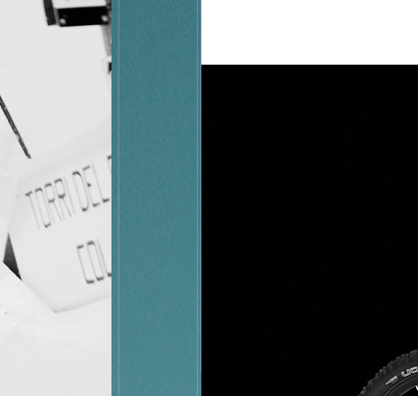
take a look at attached screenshot. the white boxes/image thumbs seem to *almost* touch the vertical grid column lines, but are a little erratic. i'm guessing those grid lines are spot on, so for ease of edit, try setting snap to object on and slightly scale the box width so that they touch those lines perfectly. take time and go through all 4 of them to make sure it looks spot on zoomed in. thats only edit, reupload files after that. all need to upload is .ai (not outlines), pdf and tiff
thx
i'm being picky on this because im trying to get them to have us do a 15page booklet next so i want quality to be up there high.
take a look at attached screenshot. the white boxes/image thumbs seem to *almost* touch the vertical grid column lines, but are a little erratic. i'm guessing those grid lines are spot on, so for ease of edit, try setting snap to object on and slightly scale the box width so that they touch those lines perfectly. take time and go through all 4 of them to make sure it looks spot on zoomed in. thats only edit, reupload files after that. all need to upload is .ai (not outlines), pdf and tiff
thx
Comments
Justin Bernard on November 12, 2013:
Taylor Bernard on November 15, 2013:
maybe we just sent him a jpg low res proof.
either way, ive renamed the files to 111513 to show change and sent him the pdf and tiff i had. the tiff i accidentally exported without artboards checked so it had whitespace on top and bottom. i fixed that and re-uploaded the whole big .ZIP file up on the server.